Want to boost your job applicant conversion ratio by 10%?
My what?
Your conversion ratio........that's the ratio of people who look at a job vs click on the apply button.
We recently introduced some cool new functionality that allows users of iKrut to add a little bit of content at the top of their job descriptions. Nothing too fancy at this stage (watch this space) but still a big leap forward compared with basic boring text job adverts.
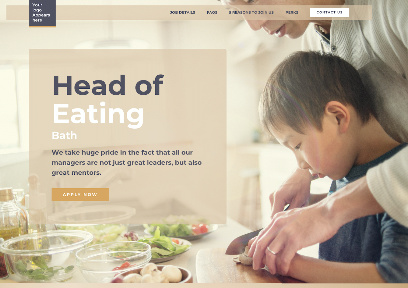
Here's an example of what anyone can do.....you just need to take an image, add a bit of content on to it:

From the early analysis we have done we're seeing around a 10% increase in the conversion ratio........just by adding a graphic like this on your job. (that's 10% more applicants)
Is the future of the job description an infographic? Maybe we won't use conventional job descriptions again - maybe it will be video based.
So why would this make a candidate more likely to apply?
1 - you are giving them additional content and information. The more specific you can be to that department or even job, the better
2 - it's a well known phenomenon in psychology that the more someone feels that you trying incredibly hard to impress them (in whatever context), the more likely they are to apply to you. Any candidate looking at this is going to think.....'Yup, they are really trying hard to impress me'.
3 - there is a certain intangible at work in any advert, a kind of 'wow effect'. There's a reason Mercedes don't write 1000 characters describing the benefits of their new multi gismo/wiz bang transmission system......it's because words are boring. A stunning picture with barely any text is an attention grabber and that's ultimately what you need the first part of the job description to be. It has to wow the candidate, grab their attention and make them want to look at the job details below.
When the candidate hits the job details page you need to grab their attention first and then stimulate their interest. The image/graphic grabs their attention, the job description (hopefully) should stimulate their interest. Job descriptions should follow the AIDA model beloved in the advertising world: attention, interest, desire, action. So take a look at the jobs on your website and be honest, how many look even remotely visually enticing? Sure, the job details might be beautifully written and amazingly informative but there’s a reason why adverts for cars, computers, watches, phones etc are not 300 words of text. Instead they are invariably a powerful image with a few lines of text at the very most, designed to grab the reader’s attention.
If that doesn't work, then the additional content you offer on your mini job presentation via other sections.......5 reasons to join us, FAQs, A day in the life of a xxxxx etc etc......these will so impress a candidate that you will see major increases in the numbers of people wanting to apply to you.
Looking for an ATS - iKrut can help. Go to www.ikrut.com, sign up and start using it free of charge.